
Everyone's heard of match.com, OKCupid, and even Tinder. But amongst the young South Asian community, the most well-known dating app is called "Dil Mil." The app itself is much like Tinder, but the potential partners are all South Asian, and the app allows you to specify the type of partner you'd like, based on several parameters. You're allotted several "dils" (hearts) a day, and you wield them upon partners you deem worthy. (This is something I learned after several minutes of analysis, because it doesn't explicitly say it anywhere.)
After hearing from various friends that the app is slightly confusing and could look a little better, I decided to do an analysis of the application by setting up a profile for myself and using it for a day. The beauty of Dil Mil is being able to specify down to the career you want your potential partner to have- so the struggle then becomes displaying that much information on such a small screen.

First, I catalogued all the problems I had with the application. Next, I determined what solutions would tackle as many of those problems as possible. Then I began to sketch. Finally, I created higher resolution mock-ups of the solutions. Check them out below.
Problems
1. Profile setup is clunky
2. Desired partner preferences set to default (have to go searching in settings to change them)
3. Key information shown once at first use of app, but then is not findable afterwards
4. Time restraint on photos seems unnecessary? However, even if needed, not implemented well
5. Tapping on photos advances the photos (before 5 allotted seconds are up), but that's not made clear
6. Potential partner profile information displayed strangely
7. To display photos with prominence, other information is lost, the screen also looks cut off
8. Unclear what "dils" are for, because it's never explained. Is it number of "likes?" Is it a variable amount?
Solutions
A. Redesign potential partner screen (tackles 4, 5, 6, 7)
B. Redesign settings to display info better (tackles 1, 2, 3, 8)
C. Redesign profile setup experience (tackles 1, 2) (animation coming soon)
1. Connect to Facebook
2. Tell us about yourself!
3. What do you like?
4. Here's how it works!
5. Meet some dils...
Solution A

Before

Before
The five second limit on each picture is implemented via a moving bar on the bottom, very unclear. Tapping on the picture also advances it faster than five seconds. To alleviate that, the new solution follows a "snapchat" style advancing system, where the user knows how many total seconds remain, and can tap if they're done viewing a certain image. After all the pictures have been viewed, the potential partner's biography and information is displayed in a more condensed format, without unnecessary icons.

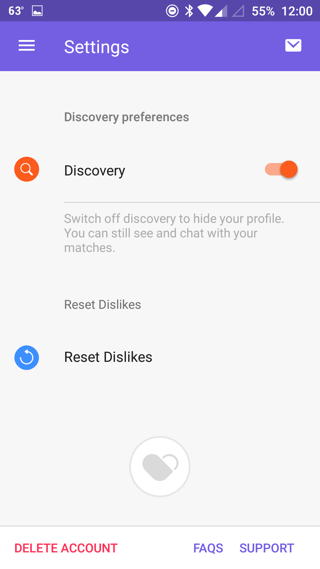
Solution B


Notice that in the "before" screens, the information doesn't have consistency in color, iconography, or selection style. In the "after," it's up to Google's standards. Additionally, the spacing is rather confusing, none of the information requires that much real estate, and each field is "filled in" with a pop-out screen, which seems unwieldy. Instead, the user should be able to see all of their options on one scrollable screen, so that they don't forget where in their journey they are, or which fields they've filled out already. The solution is to simplify as such:
